Filtering
Filtering allows a user to add or remove data items from a displayed data set by turning on and off certain predefined attributes.
Overview
Filtering allows users to trim down visible items when working through large data sets. Filters can help a user find something they’re looking for, see available options within a certain set of criteria, and make a decision when faced with a large number of options.
Selection methods
Choosing the right filter selection method will improve usability and user efficiency. Carbon supports several selection methods that are appropriate for different situations. Consider the data your users are looking at, what they are trying to achieve, and how they might intuitively narrow down the data.
| Selection method | Description |
|---|---|
| Single selection | The user can pick only one attribute to modify data results. |
| Multiselection | The user has the option to pick more than one attribute to modify data results. |
| Multiple categories | The user has the option to select attributes across multiple data categories. |
| Multiple filters with batch updates | The user selects multiple filters and then takes an additional action to apply the filters. |
| Multiple filters with instant updates | The data is updated as the user selects each filter. |
Single selection
Use a single-selection filter when the user can pick only one attribute to modify data results. Under the hood, single selection behaves like a radio button. Types of single-selection filters include:
- Basic dropdown
- Inline dropdown
- Radio button set (either standalone or within a menu)
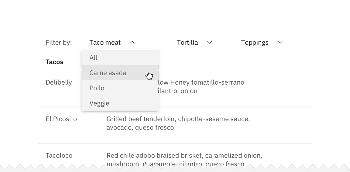
Example of a single selection filter in an inline dropdown
Multiselect
Use a multiselect filter when the user has the option to pick more than one attribute to modify the data results. Under the hood, multiselects behave like checkboxes. Types of multiselect filters include:
- Multiselect dropdown
- Inline multiselect dropdown
- Checkbox set (either standalone or within a menu)
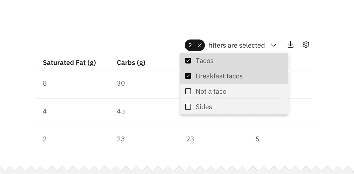
Example of a multiselect filter in a checkbox set
Selecting multiple categories
A category is a set of filter items within the same topic. For example, “size” is a category and
small
medium
large
extra large
Multiple category selection is usually placed vertically on the left side of the page or horizontally at the top of the data set. Multiple categories should never be put within a menu or dropdown.

Example of multiple filter categories
Multiple filters with batch updates
Use a batch filter when all filters are applied together at the end of the selection process. The data set only refreshes once at user action. The trigger is most commonly an “Apply filters” button.
The batch filter works best when the user is making several filtering selections across different categories that may take a longer time to mentally process. Batch filtering is also a good solution for slow data-return speeds. This can prevent the user from having to wait for the data to load after every selection.
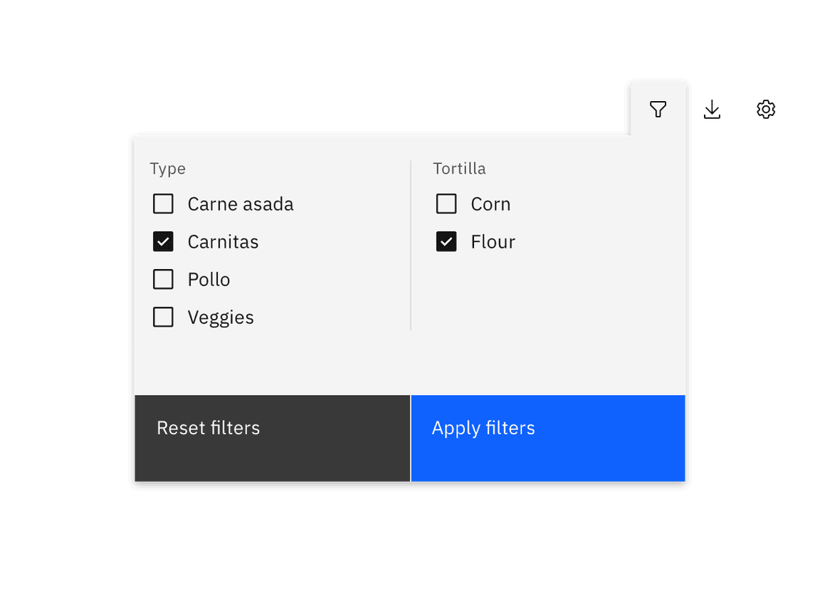
Example of batch filtering
Multiple filters with instant updates
This method returns results after each individual selection is made. The trigger is the individual selection and the filter manipulates the data in real time. This is a good solution for when the user is only selecting from one category or the user is expected to only make one filter selection.
Filter states
Filters within each category should start either as all unselected or all selected. When using multiple categories, the start state can vary from category to category. If the user typically wants only one or a few criteria to be excluded from the results, then all filters should be selected at the start. If the user typically wants to see only results related to one particular criteria, then all filters should start as unselected.
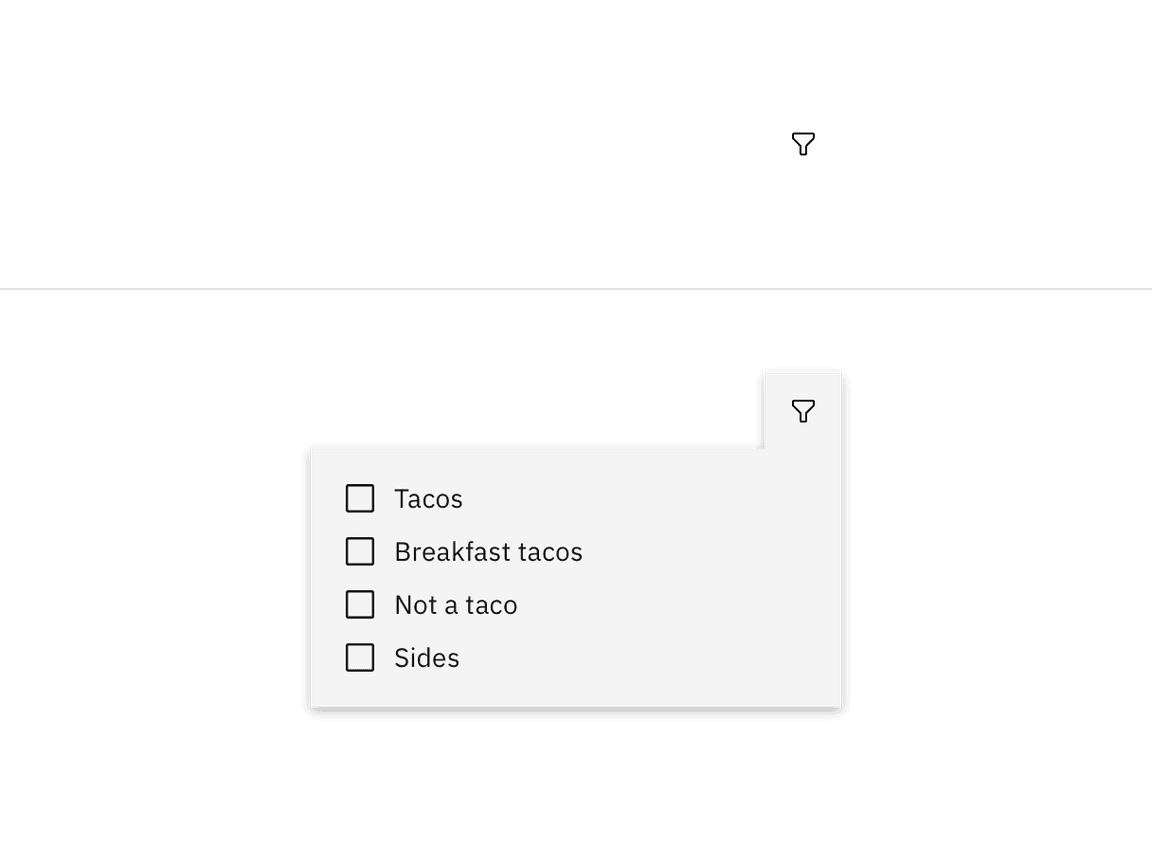
Example of filter without selections
If the filter(s) can be hidden in either a drawer, dropdown, or menu, then there should be an indicator visible on the closed filter state that informs the user that filters have been applied. At a minimum, the indicator should include the number of filters applied and have the option to clear filters without re-opening the filter container.
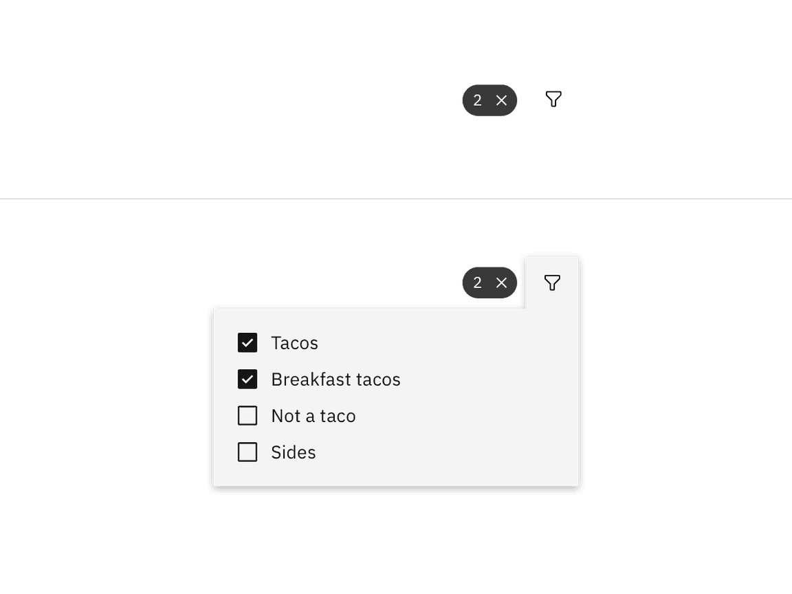
Example of filter with selections
Resetting filters
Each category should have a way to clear all applied filters at once without having to interact with each individual item. Clearing filters returns the filters to their original default starting state.
If multiple categories have been applied to the same data set then there should also be a way to dismiss all filters across all categories at once.

Related
Components
Patterns
References
- Patternfly, Filters (2019)
- Nick Babich, Best Practices for Search Results (2017)
- Think with Google, In-App Search (2016)
Feedback
Help us improve this pattern by providing feedback, asking questions, and leaving any other comments on GitHub.